At LoadForge, we’re always working to make it easier for you to understand the performance of your systems under load. That’s why we’ve just rolled out a powerful update to the Graphs section of your Reports!
The newly enhanced Graphs page now includes rich, interactive visualizations across five key performance areas:
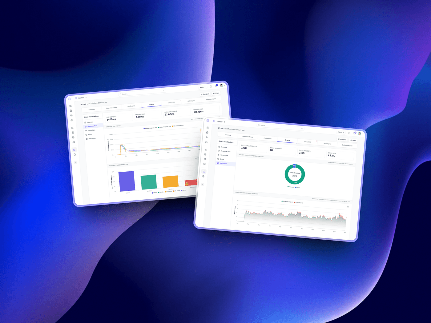
🚀 Overview
Get a quick snapshot of your entire test run with high-level metrics like total requests, average response times, and success rates—perfect for identifying trends at a glance.
⏱️ Response Time
Dig into how your application responds under stress. We break down average, min, max, and percentile response times so you can spot bottlenecks and anomalies in real-time.
📦 Throughput
Monitor how many requests per second your app can handle. This section helps you understand how load scales and whether your infrastructure is keeping up.
❌ Errors
Instantly visualize error rates, including HTTP errors, timeouts, and failed connections. See what's breaking—and when—so you can act fast.
These new graphs are designed to make troubleshooting faster and performance analysis clearer. Run your next test, head to the Graphs tab on your report, and see your data come to life.